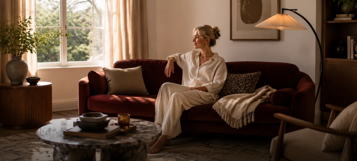
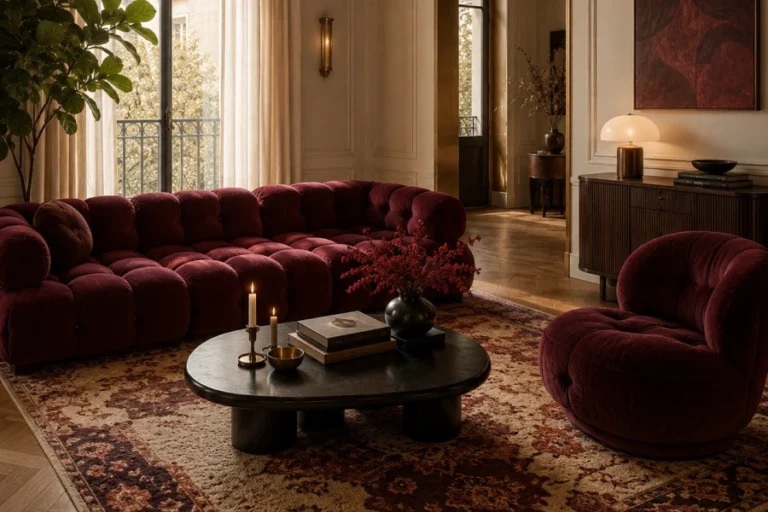
Color is the first thing anyone notices in a room. It sets the mood before a single object registers. A cohesive color scheme quietly holds an entire home together. Without one, rooms can feel disconnected and slightly chaotic. With one, your home reads as calm, intentional, and complete. The good news is that color harmony follows simple principles. This article explains how to build a palette that flows. You will learn to choose a base, balance tones, and connect rooms. Each step makes the next decision feel obvious. By the end, color will feel like a tool rather than a gamble.
What Makes a Cohesive Color Scheme Work
Harmony comes from relationships, not from a single color. Most successful palettes rest on three coordinated tones. A dominant color usually covers about sixty percent of a space. A secondary tone fills roughly thirty percent more. An accent color adds the final, energizing ten percent. This balance keeps a room lively yet restful. Practical paint palette planning makes those ratios easy to apply. Undertones matter as much as the colors themselves. Warm and cool tones should be chosen with care. Get the relationships right, and everything simply clicks.
Finding Your Starting Color
Every palette needs one honest starting point. Look to something you already own and love. A patterned rug, artwork, or sofa works beautifully. Pull two or three shades directly from that piece. This trick guarantees your colors already belong together. Consider the mood each option naturally creates. Blues soothe, yellows energize, and greens ground a room. Test large paint samples on the actual walls. Colors shift dramatically under different lighting conditions. A confident starting color makes the rest fall into line.
Building a Cohesive Color Scheme Room by Room
A whole home rarely wears one single color. Instead, each room varies a shared family of tones. Keep one thread running quietly through every space. Perhaps a warm gray appears in every room somehow. Vary the intensity while holding the undertone steady. A bedroom might soften what the living room states boldly. This repetition creates flow without dull monotony. Helpful coordinating room colors keep the transitions smooth. Each room feels distinct yet clearly related. The house then reads as one thoughtful whole.
Balancing Bold and Neutral Tones
Bold color excites, but too much overwhelms quickly. Neutrals calm the eye and give it rest. The best rooms balance these two forces carefully. Use neutrals as the quiet backdrop for daily life. Let bold shades appear in smaller, changeable pieces. Cushions, art, and throws carry color without commitment. This approach keeps your home flexible over time. Swapping accents refreshes a room in minutes. Walls and large furniture stay calm and timeless. Balance, once again, is the guiding principle.
How a Cohesive Color Scheme Flows Between Rooms
Flow is what turns separate rooms into one home. Sightlines between spaces should feel gentle, not jarring. Carry a color from one room into the next deliberately. An accent here becomes a wall color there. Smooth whole-home color flow guides the eye naturally through the house. Hallways and open plans especially need this care. Repeated tones act like quiet visual echoes. Nothing should feel like an abrupt surprise. Consistent flooring also reinforces that sense of unity. Connected color makes even a large home feel intimate.
Common Mistakes With a Cohesive Color Scheme
A few simple errors undo an otherwise lovely palette. Choosing colors under store lighting is a classic trap. Ignoring undertones causes clashes that are hard to name. Using too many competing colors creates visual noise. Matching everything too perfectly feels flat and lifeless. Forgetting the ceiling wastes a valuable surface. Skipping sample testing leads to costly repainting. Rushing the process almost always brings regret. Take your time and trust gradual decisions. Avoid these pitfalls, and your palette stays graceful.